

Most websites today are designed to look good on any device. But how they achieve that can make all the difference. Two approaches dominate this space: responsive and adaptive design.
While they may sound interchangeable, they’re not. If you’ve ever pulled up a site on your phone and thought, “this feels clunky,” poor design strategy might be to blame. So let’s break down the differences, benefits, and how to choose what’s best for your site in 2025 and beyond.
What Is Responsive Design?
Responsive design uses fluid grids and CSS media queries to automatically adjust content to the size of a screen. Whether it’s a desktop, tablet, or phone, the layout adapts dynamically.
It uses flexible grids, percentages, and media queries to adapt content based on the screen size. The layout “responds” to the device automatically.
Key characteristics:
- One layout that adjusts dynamically
- Relies on CSS media queries and flexible containers
- Popular in frameworks like Bootstrap, Tailwind, and Webflow
- Easier to maintain long-term
Pros:
- Seamless experience across all screen sizes
- Easier to scale and future-proof
- Great for SEO (Google favors mobile-responsive sites)
- One codebase, fewer maintenance headaches
Cons:
- Can be slower to load on mobile if assets aren’t optimized
- Requires thoughtful design to avoid awkward content stacking
- Sometimes harder to fully “customize” per device
Responsive design is great for content-heavy sites where consistency matters more than custom tailoring. Think blogs, portfolios, or standard marketing sites.
Adaptive Design: Tailored by Device
Adaptive design uses predefined layouts for specific screen sizes. Instead of resizing one layout fluidly, it switches between a set of fixed layouts based on the device or viewport.
Key characteristics:
- Multiple static layouts (e.g., one for desktop, one for mobile, one for tablet)
- Device detection or breakpoints determine which layout is served
- Often used in native apps or complex desktop-to-mobile transitions
Pros:
- Pixel-perfect control over each experience
- Faster load times on mobile (if assets are optimized per layout)
- Useful when content or navigation needs to change dramatically between devices
Cons:
- More time-consuming to design and develop
- Higher maintenance (multiple layouts = more upkeep)
- Can struggle with new screen sizes or hybrid devices
So… Which One Should You Use?
Adaptive design is like packing separate suitcases for different trips: one for the beach, one for the snow. Each one is tailored in advance for its destination.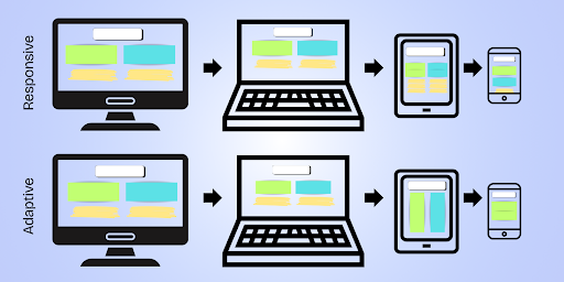
Responsive design is like packing one backpack that reshapes itself as you travel: expanding for big items, shrinking when you need to move fast.
Which method you should choose depends on your project’s goals, audience, and resources.
- Situation: You’re building a marketing site or blog that needs to scale easily
- Best fit: Responsive
- Situation: You’re optimizing for specific device experiences (like TV vs mobile)
- Best fit: Adaptive
- Situation: You want fast dev time and easier SEO
- Best fit: Responsive
- Situation: You’re redesigning a legacy app or kiosk experience
- Best fit: Adaptive
- Situation: You have a small team and limited dev budget
- Best fit: Responsive
Real-World Example: Responsive in Action
Let’s say you’re building a startup landing page in Webflow. You design your layout once, and then adjust it using breakpoints (mobile portrait, tablet, desktop, etc.). The layout stretches or stacks automatically, and you tweak spacing as needed. One codebase. Easy updates. SEO and speed optimized.
That’s responsive.
Now imagine a retail giant building a custom e-commerce platform. They want totally different navigation and layout on mobile, desktop, and tablet, with unique image assets for each. They build 3 separate layouts and serve the appropriate one depending on the device.
That’s adaptive.
Which One Is Better for SEO?
While Google recommends responsive design, adaptive design isn’t penalized as long as it’s implemented properly. SEO boils down to:
- Mobile usability
- Fast load times
- Crawlable content
- Clear structure (headings, alt text, metadata)
Responsive sites typically perform better out of the box, but adaptive designs can outrank them if they’re better optimized overall. Use tools like Google Lighthouse to benchmark performance and accessibility.
Don’t Forget Accessibility and AX
A sleek layout means nothing if your site isn’t usable for all audiences (or for AI).
Accessibility ensures people using screen readers, keyboard navigation, or assistive tools can navigate your site. Whether you choose responsive or adaptive, always:
- Use semantic HTML (not just styled <div>s)
- Ensure proper contrast and font sizing
- Test tab navigation and skip links
AX (Agent Experience) is about making sure your site communicates well with AI agents like ChatGPT or Google SGE. A clean heading structure and semantic layout help both people and machines parse your content efficiently. To learn more, read Accessible by Design: How AX and Accessibility Overlap.
Performance Impacts
When it comes to load speed, responsive and adaptive can differ:
- Responsive sites often serve the same assets to all users, which may slow mobile load times.
- Adaptive sites can serve lighter assets to mobile users but require more development overhead to do so.
Use tools like:
- PageSpeed Insights
- WebPageTest
- Microsoft Clarity for heatmaps and session recordings
Don’t make assumptions. Measure and iterate.
Think Beyond Devices
Screens aren’t the only thing evolving—user expectations are too. Your design approach should support content discovery, accessibility, and performance across more than just device types.
Voice search, smart displays, and AI chat interfaces are all reshaping how people interact with websites.
For example:
- A responsive site might look good, but if it’s missing metadata or proper headings, AI won’t summarize it well.
- An adaptive site might work beautifully on mobile, but if it doesn’t account for assistive technology, it’s excluding users.
Future-proof your site by thinking holistically.
Webflow’s Approach
Webflow makes responsive design the default, with drag-and-drop controls for breakpoints (desktop, tablet, mobile landscape, mobile portrait). You can:
- Customize layouts per device without custom code
- Use reusable components for consistent UX
- Integrate schema, alt text, and performance optimizations in the Designer
While Webflow doesn’t support full adaptive design (e.g., device-specific versions), it’s excellent for brands who want visual control without code bloat. For lean teams, it’s a powerful way to scale across screen sizes while staying SEO- and AX-friendly.
Final Thoughts: Choose Strategy, Not Just Style
Responsive design is often the smarter choice for small-to-mid-sized businesses due to its ease of maintenance and Google-friendliness.
Adaptive design is great for large-scale platforms with specialized user flows (think airline booking engines or fintech dashboards).
The right choice depends on your team’s capabilities, your performance goals, and your audience needs.
Remember:
- If you want scalability, go responsive.
- If you want control, go adaptive.
- If you want accessibility, SEO, and AI-readiness—do either, but do it well.
Your website isn’t just a screen. It’s a system. Make sure it works wherever (and however) your users find you.
Composite, a NYC-based Webflow Enterprise Partner, builds and helps migrate sites from legacy platforms to Webflow. Ready to make the switch? Let’s talk.